
User Interface Overhaul
During our last Closed Alpha Weekend event, we mentioned a lot of our visual content being placeholders. Today, we are excited to take another step closer to Early Access with a complete overhauling of our User Interface!
During our last Closed Alpha Weekend event, we mentioned a lot of our visual content being placeholders. Today, we are excited to announce bringing Predecessor to life with its own unique feel and an overhauling of what you remembered with our UI.
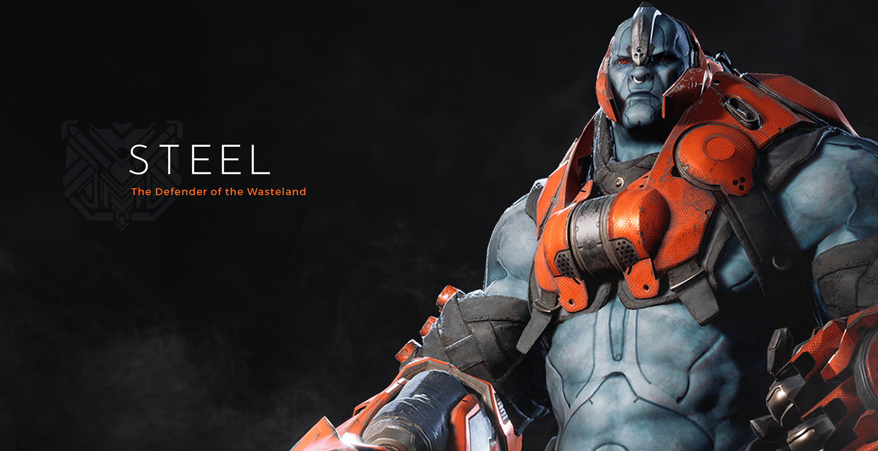
With community feedback, we were able to add several changes to our User Interface design. For example, you can now view all of the ability information you need for your favorite character under an Abilities tab. Gone are the days of wondering what an ability does and how much damage you're dealing. You can learn it all before diving into your first game. For now, our focus is on The Defender of the Wasteland himself and the overall feeling of the User Interface.
Let’s take a closer look. We have zeroed in on what Predecessor should feel like. While what you see is subject to change, it is the direction we are taking to create an original feel.
We've updated our settings menu to provide clear information at a glance allowing you to customize your gaming experience. On the visual settings screen for example, maybe you prefer epic effects with a side of medium foliage. This is just a small taste of what you can expect to see when you jump back into the world of Predecessor.
Although we've updated our home screen, our aim is still to get you on the battlefield as quickly as possible. Our new “Match Found” screen is designed to grab your attention and ensure you ready up as soon as possible.
We’re actively testing internally and gathering feedback, so everything you see here is already in-game. However, we're keen to hear your thoughts on what you'd like to see and how we can improve your experience.
Tweet us @PredecessorGame your thoughts on the new User Interface and let us know what you'd like to see in future blog posts.


